DAVID INSHAW
David inshaw is one of Britain's most celebrated figurative artists and a former member of the Brotherhood of Ruralists.

This painting was one of the first to establish Inshaw's subsequent reputation as a fine figurative painter.

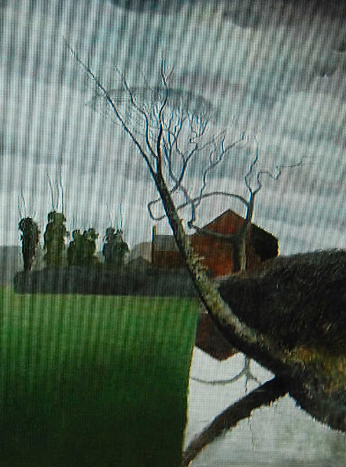
The Presentiment (1973-78)
Those familiar with this painter's best work will recognize the sculptured trees, smooth lawns and somewhat menacing skies - as in the equally famous painting (above).
I have always found it difficult to 'place' Inshaw's landscapes. They often belong, in my mind at least, to more fictional settings - like those created by Virginia Woolf in her experimental novel The Waves, for example or T.S.Eliot's garden settings in 'Burnt Norton' - part of Four Quartets.

Apologies for the quality of this reproduction!
There is something slightly Edwardian about The Presentiment, with its brooding clouds yet dramatically 'stage-lit' from the right of frame. This indeed could be a scene from Virginia Woolf's last novel - Between the Acts - a patriotic pageant set in 1941 (the year Woolf committed suicide). Note (in the above detail) the St George flags incongruously present in this otherwise private garden.

I have no idea if this is something that Inshaw himself acknowledges although he did paint this tribute (above) to Virginia Woolf in 1971 so perhaps I am not that far off the mark. What, however, he shares with Woolf is a highly developed awareness of 'Englishness'; an innate sense of (suppressed) tension or drama and a nostalgia for a (largely) imaginary rural past, much of which, perhaps, has long since vanished.

Homage to Virginia Woolf (1971)
I have no idea if this is something that Inshaw himself acknowledges although he did paint this tribute (above) to Virginia Woolf in 1971 so perhaps I am not that far off the mark. What, however, he shares with Woolf is a highly developed awareness of 'Englishness'; an innate sense of (suppressed) tension or drama and a nostalgia for a (largely) imaginary rural past, much of which, perhaps, has long since vanished.

This possible connection with Virginia Woolf's Between the Acts is also present (for me at least) in the above painting - it even has a WWII bomber plane!
Again, a subtle sense of menace is present - imminent yet unstated - despite the naked woman's languid pose. This is a moment caught in time - mysterious and slightly menacing; note the figure top left. Voyeur or participant?
Again, a subtle sense of menace is present - imminent yet unstated - despite the naked woman's languid pose. This is a moment caught in time - mysterious and slightly menacing; note the figure top left. Voyeur or participant?

I first discovered David Inshaw's quintessentially 'English' paintings sometime in the 1970's - at London's Waddington Galleries. I was hooked from then on and have followed his career with keen interest for many years thereafter
The above painting - called The Raven - is one of his most famous and was painted in 1971. I find the tender melancholy of this painting very moving. As noted above, there is in many of Inshaw's landscapes an element of threat or menace, unseen perhaps but palpably present. It is here too, in the brooding skies and anxious (or is it wistful?) gaze of the central, isolated figure. If that were not enough, the raven itself is quite creepy!

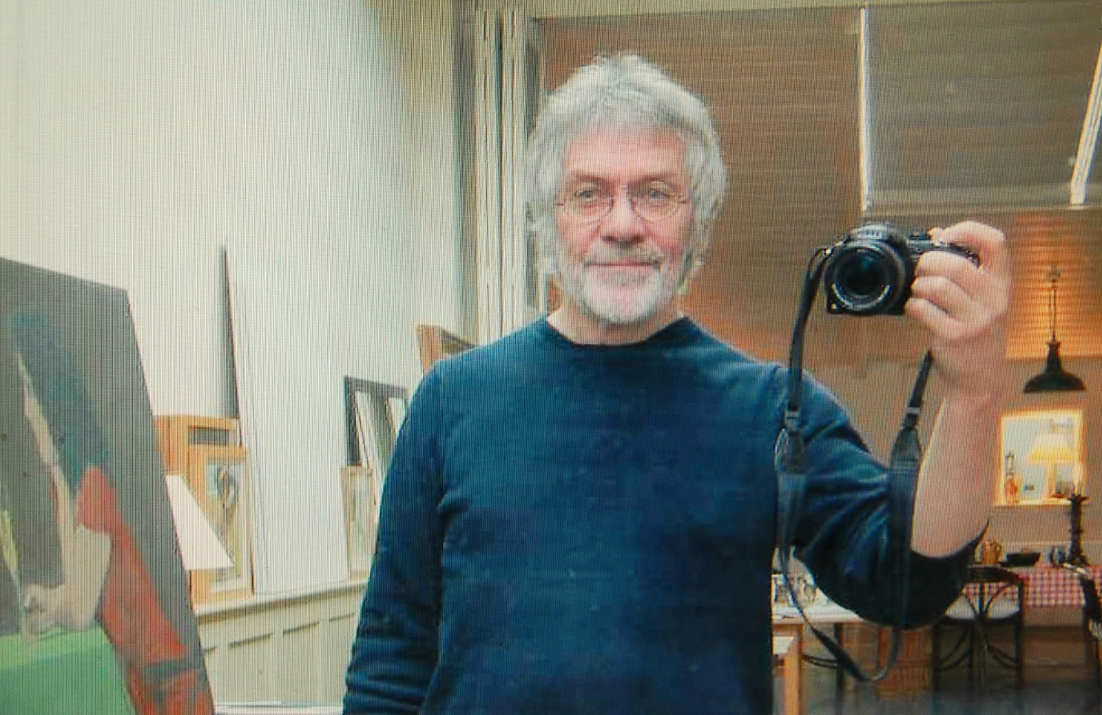
Self portrait
David Inshaw was born in 1943 in Staffordshire (UK). As a young man he studied art at the Royal Academy Schools, under Peter Greenham. A French government scholarship later took him to Paris for six months.

His first solo exhibition opened to great acclaim at the Arnolfini Gallery in Bristol in 1969 and in 1971 he settled in Devizes, Wiltshire where, with Peter Blake, he co-founded the Brotherhood of Ruralists.

His first solo exhibition opened to great acclaim at the Arnolfini Gallery in Bristol in 1969 and in 1971 he settled in Devizes, Wiltshire where, with Peter Blake, he co-founded the Brotherhood of Ruralists.

His graphic skills are evident in this drawing, made in 1975. It is called Full moon for Elizabeth and combines meticulous natural detail with a gentle, understated eroticism.

This painting of a young woman (Robin) is more explicit. The woman's reflective gaze and nonchalant pose makes this picture delightfully provocative. It is a pose that Balthus often used - a possible 'influence' I shall look at later in this article.
Although we are mostly familiar with Inshaw's landscapes, there is an erotic element that runs throughout his work that is less prominent perhaps but equally important.

Blind Man's Buff (1983)
David Inshaw has often said that Stanley Spencer was one of the artists that influenced him. Since he shows little of Spencer's religiosity, I assume that it is his depiction of the human figure that he draws upon in his own work.

Stanley Spencer
What I think Inshaw shares with Spencer is a healthy, at times provocative, lack of interest in the prurient. His nudes - like those by Stanley Spencer or, more recently, Lucian Freud - are erotic but never salacious.
 What you see is what you get and his women are simply naked, often - moreover - in a 'social' context - as in this delightfully uninhibited 'tribute' to Bacchus or the wittily titled Blind Man's Buff shown above.


Mermaid
What is interesting, perhaps, is that his drawing of the female figure is less meticulous than that of the landscapes yet bolder and often more imaginative - as in the above, somewhat surreal depiction of a 'Mermaid'.
To these nude paintings he often adds an element of humour - as in (below) these two young women dancing on a beach in Pembrokeshire. It makes Jack Vettriano's beach dancers look positively staid!
To these nude paintings he often adds an element of humour - as in (below) these two young women dancing on a beach in Pembrokeshire. It makes Jack Vettriano's beach dancers look positively staid!

(1993-2002)

The Letter
What David Inshaw may also have got from Stanley Spencer is that artist's stylized way of depicting both the figures within his landscapes and the foliage surrounding them
This wonderful painting (below) by Spencer contains many of the elements that resurface in Inshaw's own work - albeit modified or adapted to a new and different sensibility.

Zacharias and Elizabeth by Stanley Spencer (1913-14)
In the detail below you can see Spencer's strong
cloud shapes, detailed yet simplified plant or tree forms and the rounded
shapes of his figures.
Detail from above painting by Stanley Spencer
The human shapes - reduced to rounded, generalized forms - also appear in Inshaw's work, as in this delightful painting (below) of two lovers stealing a kiss. These could easily be two villagers from Spencer's beloved Cookham rather than Kew!

Lovers near Kew Gardens (1976)
Stylized foliage is also evident in the work of a much earlier artist - another of David Inshaw's acknowledged influences - Samuel Palmer (1805-1881). Palmer's detailed leaf patterns and tree shapes were considered revolutionary (not to say 'strange') at the time. Blake - another early influence - suffered similar derision from his critics.
Early Morning - Samuel Palmer (1825)

Compare this with similar drawings by Inshaw (as in Full Moon for Elizabeth, shown near the top of this article) or with this tree study in pencil (below). In both and you will see the skill and hard work that underpins even the most stylized representation of trees and plants.

David Inshaw
Apologies for the poor quality of my photograph of this exquisite drawing!

Samuel Palmer - Pastoral (1831-32)
The Brotherhood of Ruralists included Graham and Ann Arnold, 'Pop' artist Peter Blake, Jan Haworth, and Graham and Annie Ovenden.
Based largely in the West Country, The Brotherhood began to exhibit their work as a group in 1976, showing together at the Royal Academy Summer Exhibition that year. What marked their work was a real regard for nature and a highly detailed painting style. Figurative painting ran counter to contemporary trends even then so their collective stance was a bold one.
Orchard in Coombe Valley - David Inshaw (1976)
 i
i
I am reminded at this point of another landscape artist whose work I much admire, namely Douglas Wilson.
Wilson was born in Wales in 1936 but has worked most of his life in Shropshire - an equally beautiful county not far from Inshaw's studio and home in Devizes, Wiltshire.

This wonderful painting sets the beautifully rendered wild flowers in the foreground against a sloping landscape, touched with warm, golden sunlight. The slope adds an unexpected 'edge' to this otherwise tranquil image of the Shropshire countryside.

Douglas Wilson
Both artists also share an interest in bold, natural forms - as in Douglas Wilson's Dorset hill (above) or David Inshaw's Portrait of Silbury Hill (below), painted in 1989.

I particularly like Douglas Wilson's composition (below) with its 'vertical' orthognals, square-on viewpoint and remarkably delicate tracery of the bare, wintry tree. This has a very 'modern' feel to it while the skill used in depicting the skeletal tree forms is very high indeed. The reflection in the stream is wonderfully rendered.
Compare this with Inshaw's equally striking composition (below), called Storm over Silbury Hill Similar front-on composition with reflective water but Inshaw has given his painting the drama of multiple, forked lightening striking the ground on the horizon.
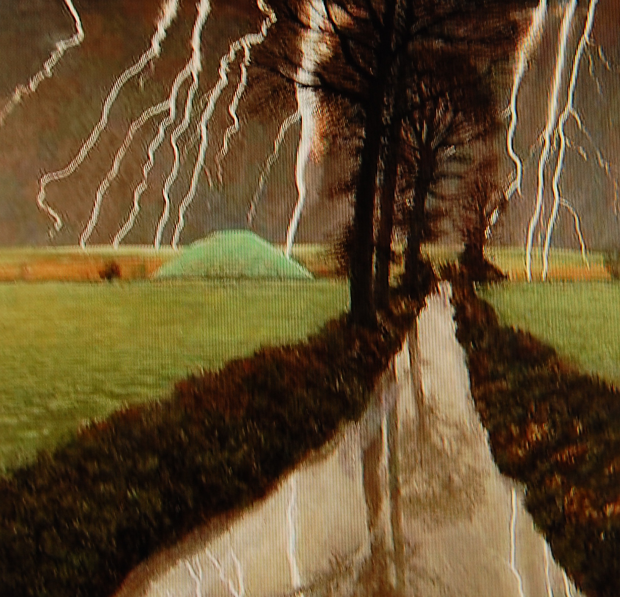
I have no idea if either artist is aware of the others work but they both share a fine sense of composition and structure, together with a very close attention to (albeit stylized) natural forms. This is contemporary English (or should I say, British) figurative landscape painting at its best and it is a pity that Douglas Wilson' work is not better known or appreciated.

Rendezvous - Douglas Wilson
This fine painting (above), also by Douglas Wilson, is called Rendezvous. Again, bold composition, wonderfully depicted lichen on the wall and meticulous tree forms lovingly painted in precise detail.

Hand Holding - David Inshaw (1994)
Of the two, I suspect that Inshaw is the better artist for his compositions are bolder and display a more confident use of the figure as an essential part of the visual narrative - as in the above painting, full of (cleverly muted) drama.
Again, there is a subtle sense of partially hidden drama; a subtext that relates to an intimate recollection or even secret wish-fulfillment. In my view, this is a stunning composition and one of my favorite paintings by David Inshaw.
Again, there is a subtle sense of partially hidden drama; a subtext that relates to an intimate recollection or even secret wish-fulfillment. In my view, this is a stunning composition and one of my favorite paintings by David Inshaw.
With Douglas Wilson, the figures in space are more tentative, less dominant - as in the sympathetically rendered gardener at work (below) gathering in his onions...:

Lifting the onions - Douglas Wilson
Or the isolated villager (below) hurrying home to catch the six o'clock news (probably followed by the Archers) on BBC radio.
This is the forgotten world of Sir Edward Elgar, A.E.Houseman, Mary Webb or the Welsh paintings of Richard Wilson. It is also a remembered world perhaps, from the pre-war days of the artist's youth.
This is the forgotten world of Sir Edward Elgar, A.E.Houseman, Mary Webb or the Welsh paintings of Richard Wilson. It is also a remembered world perhaps, from the pre-war days of the artist's youth.

The six o'clock news - Douglas Wilson
Note the beautiful detail (above) of the briar in the foreground. This is almost Elizabethan in its decorative elegance - reminding me of Nicholas Hilliard (1547-1619) and his miniature painting on enamel called Young Man Among Roses (1588).

What I think both artists also share, therefore, is a deep sense of the history of landscape. In Inshaw's case it is Palmer and Spencer.
I can also see evidence of Balthus' influence or inspiration in Inshaw's work - not just in his figure drawing (as suggested above) but in the French artist's lesser-known yet highly crafted landscapes.
I can also see evidence of Balthus' influence or inspiration in Inshaw's work - not just in his figure drawing (as suggested above) but in the French artist's lesser-known yet highly crafted landscapes.

The Mountain - Balthus (1936-37)

Wiltshire Landscape (1984)
There are further similarities (or rather parallels, perhaps) between Balthus' (celebrated) depiction of young girls and Inshaw's often beautiful drawings of young women. Take for example Balthus' reclining figure (below) - a pose that featured in a number of his compositions with varying degrees of deliciously languid eroticism.

Nude with cat - Balthus (1949)
Now I know all reclining nudes can look alike but Inshaw's sensitive drawing of Robin Lambert (below) reflects Balthus' studied languor and brilliant draftsmanship.

Robin Lambert II (1977)
The similarities do not end there. Note also Balthus' meticulous detailing of the bare foliage in this farm scene (below). The use of light is spectacular - something that David Inshaw is also good at conveying. Is this dawn or sunset? I cannot tell but the overall effect is surely very beautiful.

Balthus
More recently, Inshaw would appear to have been working on a series of paintings that derive, in part at least, from another Balthus landscape. I should add here that this is only guess work but knowing his interest in the work of the French artist it seems a reasonable proposition.

Balthus
I apologize for the quality of this photograph!
I am not convinced that Inshaw can 'do' surrealism and his figures are lumpish and even ugly. The 'leaping cat' (Balthus was fond of cats) is a clue perhaps but for me these are not successful adaptations or re-intrepretations.


I apologize for the quality of these photographs!
Overall, Douglas Wilson's sensibility is gentler, less bold and yet his bright colors give his village scenes an upbeat, confident look. Note here (below) the brooding skies, rounded trees and simplified yet botanically correct plant forms. It's called Before the storm.

Before the Storm - Douglas Wilson
Inshaw's palette is also very colorful at times. I particularly love this 1980 waterside scene (below) with its brilliant flowers and quirky composition. The clouds are quite eccentric but it is a delightful painting and has much the same effect on me (it makes me happy!) as does Wilson's somewhat more conventional composition.

So, what conclusions can one reach and does my brief comparison between these two fine artists have any relevance to the work of either?
Well, what strikes me about them both is their profound understanding of the English countryside and the range of techniques both employ to depict that sensibility.
There is not space here to show too many of Douglas Wilson's work but some of his paintings are far more romantic or atmospheric than the few I have selected so far for this article.

The above, atmospheric depiction of oak trees covered in a wintry fog is conventional landscape painting but done with great finesse and sensitivity. There is little in Inshaw's work that is seasonal in this sense.

My favourite is this lovely, deceptively simple wintry scene in which the elements are kept to a bare minimum. It is minimalism of a high order and equal to anything David inshaw has achieved - even though, overall, Inshaw is probably the better artist.

The Canal Bank - Inshaw 1980
So, what conclusions can one reach and does my brief comparison between these two fine artists have any relevance to the work of either?
Well, what strikes me about them both is their profound understanding of the English countryside and the range of techniques both employ to depict that sensibility.
There is not space here to show too many of Douglas Wilson's work but some of his paintings are far more romantic or atmospheric than the few I have selected so far for this article.

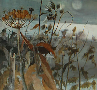
Midwinter - Douglas Wilson
Take this beautiful study of winter plants, for example. This painting shows a deft touch, great observation and a wonderful color sense - just count the variations of grey use in this one canvas to see what I mean.

Oaks - Douglas Wilson
The above, atmospheric depiction of oak trees covered in a wintry fog is conventional landscape painting but done with great finesse and sensitivity. There is little in Inshaw's work that is seasonal in this sense.

January - Douglas Wilson

Dorset Spring - Douglas Wilson (2012)
The above painting, for example, is also by Douglas Wilson and has all the qualities that I most admire in his work. These include gently rolling hills leading to a deep valley or stream; subtle modulations of color from sky to foliage; stylized yet precisely defined tree or plant forms and those wispy, white trees devoid of all leaves that take the eye up to that pale, limpid sky.
This is an elegant, tranquil and beautifully painted contemporary landscape. What it lacks, though, is any sense of drama - unlike Inshaw's remarkable painting (below) called She did not return, taking its title I believe from a poem about loss and departure by the West Country poet and novelist, Thomas Hardy.

She did not return - David Inshaw
In my view, this wonderful landscape represents David Inshaw at his best. and boldest and shows why, of the two, he is the greater artist..
On his website the version of this painting has a black sky but I think I prefer this one, taken from my print of this painting. The dark blue of the sky here picks up the blue of the woman's cloak. The golden sunlight grazing the fields and the steep rainbow gives this picture real drama and a sense of foreboding, nostalgia and anguish all at once.
I cannot think of a contemporary landscape by a British artist that comes anywhere near this masterpiece by David Inshaw.
Mike Healey
There is much new work that I have not been able to cover in this article. To find out more about David Inshaw's work, click on the links below:

Pictures used in the above article are taken from a David Inshaw exhibition catalogue published by Academy Editions, London in 1978 and David Inshaw's official website - direct access to which is given above
PRINTS BY DAVID INSHAW
BROTHERHOOD OF RURALISTS
For more about the Fine Art Society Exhibition, click on the link below:
THE FINE ART SOCIETY
If you would like to find out more about Douglas Wilson RCA then click on the link below for access to The Highgate Gallery from which I have taken most of the Douglas Wilson images used in this article.
HIGHGATE CONTEMPORARY ART
No comments:
Post a Comment